Thursday, October 26, 2006

Here are a front and back for the poster. After saying that I was ok with the placement of the logo, I realized that it looks really weird on my poster. The fact that my poster is on a white background makes the logo and url look like they're floating really high up the sides of the poster.

I'm not really much of a copy writer, so I hope the copy that I have here is ok. I might try to distress some more type for the display text on the back.

Wednesday, October 25, 2006

Rough posters

Here are a few really rough designs that I put together on the computer.

I like these first two the most. I created the "bomb" graphic in illustrator, then distressed the printout with the end of a paper-clip and rescanned the image. This poster equates our modern civilization of nuclear-armed nations with a "time bomb". With so many of these weapons in exisitance, it's only a matter of time before someone finally uses one and starts a chain reaction of retalitory strikes. I'm still not sure of the exact wording of the copy for this.This second version of the time-bomb poster would be hypothetically printed with the bomb printed in process black on a background field of rich black. This image is just trying to simulate that idea. I really don't know if it would have a high enough contrast to work in real life.Here are some type studies that I did. I distressed them all in the same way as I did the bomb graphic. I'm not sure which one to go with. Right now, I'm leaning toward Helvetica Neue.
The concept of this design is to create a background texture made of text listing negative side effects of nuclear weapons. It would have everything from "radiation poisoning" to "steals funds that could be used for civil uses". Right now it only has a few things, but I'd come up with some more for the final version.

Concept work

I joined this blog a little late, so I'll just post some of my work up to the point that I am at right now. Here are some thumbnail sketches that I did for different poster ideas. My posters are all centered around the concept that nuclear weapons are not a positive thing. Specifically, that there are so many nuclear devices in existance today that there is a very real threat to the existance of life on the planet. If even one of these nuclear devices is used, it could trigger a slew of nuclear responses that could completely destroy civilization.

Tuesday, October 24, 2006

BOMB SQUAD5 Logo

This logo was created by Professor Jason Fox. The logo and blog url will be placed in the same place on all four students' posters for consistency of the series. Thanks for the extra work Jason.
This is my recommendation for the placement. This will also be the direction for my final poster, I decided that the other poster just didn't have enough of a message or feeling to it.

{International_Fission}

Ok Professor, I told you I wouldn't abandon this idea, and I think that it has potential along with my first execution, in fact I'm torn between the two posters.

This new concept is based off of the idea of nuclear fission where atoms are bombarded with particles that cause a chain reaction and eventually, a nuclear explosion. I thought the same idea applied to the way that the world's nuclear powers might attack one another in a full out nuclear war. I tried to keep the typography very clean and "international" in style. I used Frutiger for the typography along with the arrow from Adrienne Frutiger's way finding signage in the Paris Airport. I've included a couple of different color combinations for this new one. Let me know which you like, I'm leaning towards the blue, green and gray poster.


Carl Gerhards

Monday, October 23, 2006

{N_F} flatter=better?

Professor Fox posted in our online discussion board about my initial images:

"As for the images, not bad, I wonder if there is too much going on in the background? In addition increase the baseline shift of the brackets, they're too low right now. Good typeface.

You had another idea. Don't let it go.

I haven't forgotten about the logo and INDD file. It's coming."

So, before I pass out for the evening, I quickly made up two version of the blue mushroom cloud image with a flatter background and another with all of the colors flattened. I'm not sure if the flat colors work better or not. Hopefully fresh eyes and other comments will help me make the big decision. I also fixed the baseline on the brackets.

Carl

{NUCLEAR_FALLOUT}

From all of my thumbnails, this was one of two that my professor picked. I agreed with him that it worked as a poster image. The nuclear mushroom cloud taking over the place of the tree says something about cause and effect, which is why I went with a very symmetrical reflected composition.
This was my first color version of the poster. I thought that the blue and white mushroom cloud kind of resembled a beautiful cloudy sky but still read as an explosion. I really love the colors and think that they do a great job of getting the viewer to look at the piece for longer and think about what it means. Although we're outputting this poster with a laser printer, I want to do a short run of hand screen printed posters for family, friends, and an online store I'm working on. I think that the image would make a great framed fine art print and would be a great conversation starter.
Not much different here other than an orange mushroom cloud. I like the colors here as well. This is a really easy change if I'm screenprinting.

I still have to work on the "International Fission" idea mentioned in the last post, but its hard to work up another idea when I'm so pleased with this one.

More posts this week. Comments are welcome.

Carl

Carl_Gerhards_Thumbnails

These were my first thumbnails. Some of the concepts were ok, but for the most part I was thinking too much along the lines of editorial illustration.
One sketch that I worked out larger. I got a bit attached to the outline of the retro style "Fat Man" nuclear bomb used in World War II. The negative space didn't quite work for me and I wasn't sure how to render the bomb shelter in three spot colors very effectively.
These last couple of sketches ended up being the strongest visuals and concepts. I really enjoy the reflected image of the mushroom cloud and the roots that are the only thing left from nature above the ground. I think that the image would be beautiful and interesting for a poster graphic and I could render it in three colors well. The second concept includes what would happen if one country launched a nuclear weapon and shows outlines of different nuclear powers with arrows pointing at one another. The idea for this one came from the idea of fission, the process that nuclear weapons work on. The last idea was horrid, please ignore.

Assignment Description

An introduction to the project.

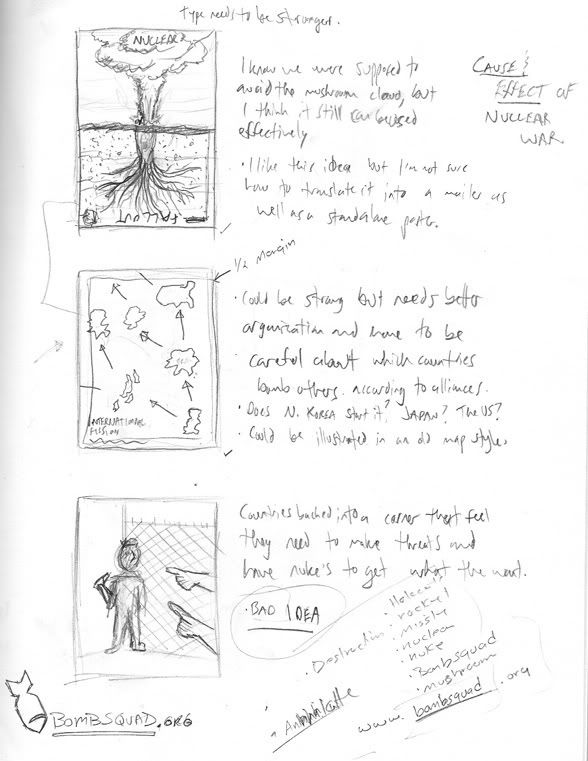
Jason Fox, a professor at the Savannah College of Art and Design assigned a social awareness mailer/fold-out poster on nuclear weapons to his Production Design class. Four students have started work on the project and will be posting their process from thumbnails to finish along with commentary and opinions on nuclear weapons today. There names are: Carl Gerhards, Kyle Sauter, Alyssa Davis, and Yuk Ming Chow. Jason may be posting his comments and thoughts along with us.

The assignment brief read as follows:

(GRDS358) Production Design: Project Three

Social Awareness Campaign

Learning Objectives:
To deliver a powerful image by establishing a successful production technique
Mixing colors
Social Issues Research
Learn to take a social idea and create a deliberate work that communicates the idea clearly

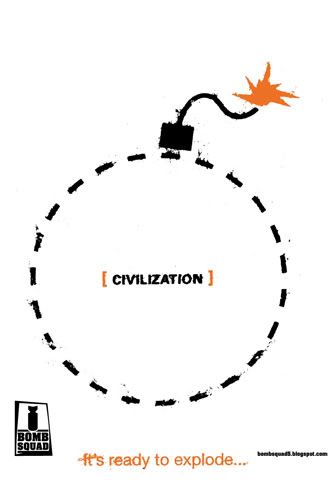
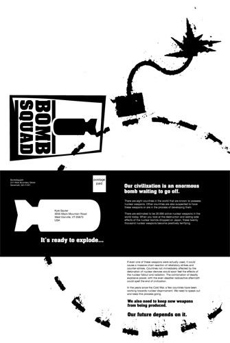
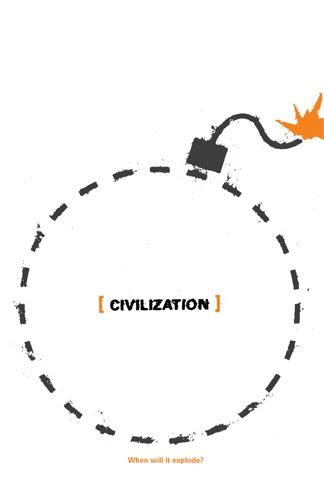
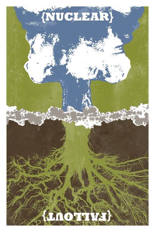
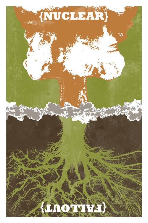
Brief: Choose a stance on the issue of nuclear weapons today. Create a poster using nor more than three spot colors. In addition, design your poster as a folding direct mail piece that corresponds with the poster in creatin attention.

Requirements:
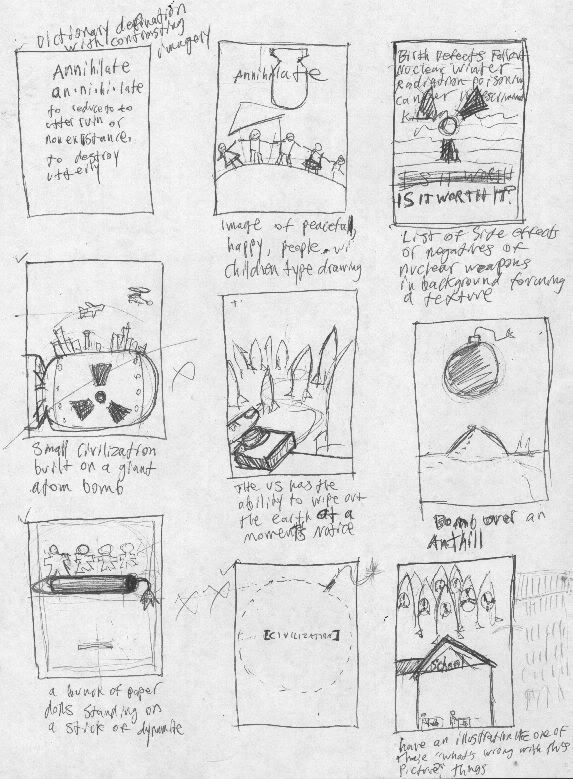
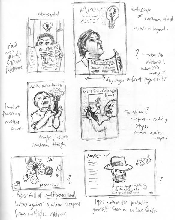
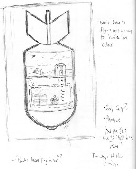
Produce sketches based on your issue stance
You may use vector or raster (via DCS) files
Poster size: 12"x18" @ 300dpi (vertical or horizontal)
Mail card size: Approximately 4"x6" or larger if necessary (vertical or horizontal)
You must create a new color by mixing at least two of your three selected spot colors
Mail cards must fall withing the USPS required mass mail Presort Standard specifications

Consider the following in your image:
The style of your image or illustration. This is very important and will establish the tone of your message.
The style of your typeface and typographic structure.