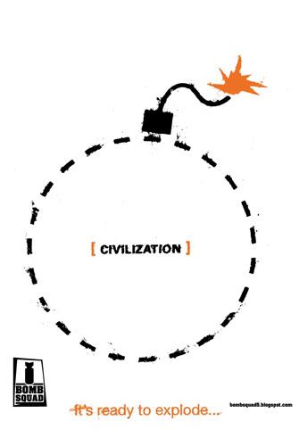
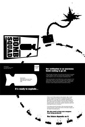
Here are a front and back for the poster. After saying that I was ok with the placement of the logo, I realized that it looks really weird on my poster. The fact that my poster is on a white background makes the logo and url look like they're floating really high up the sides of the poster.
I'm not really much of a copy writer, so I hope the copy that I have here is ok. I might try to distress some more type for the display text on the back.
I'm not really much of a copy writer, so I hope the copy that I have here is ok. I might try to distress some more type for the display text on the back.
posted by Kyle Sauter at 10:14 PM
![]()

1 Comments:
Hey Kyle, the placement for the logo that you're using is the first one that Jason sent us. I've updated the file to the one I used on my poster that we all agreed on and emailed you the file. It's also posted to the discussion board in the online section of our course.
I like the design on the back of your poster, but I think that it could use some tweaking. I'm not positive that you can do the bomb outline and whatnot on the mail front according to postal standards. The bomb intersecting the large logo is also a bit distracting. I think that the white copy in the black could get moved down to flow into the other body copy. Technically it should be 10% larger because of dot gain when printing a knockout like that.
The bold comments at the bottom of the back could use some work on the wording, they don't feel refined enough to be stand alone quotes yet. But I like the new headline on the front of your poster, it works more effectively. Keep working man, you're getting there. Hopefully I'll be posting a back to my poster in the next 24 hours or so.
Post a Comment
<< Home