{N_F} flatter=better?
Professor Fox posted in our online discussion board about my initial images:
"As for the images, not bad, I wonder if there is too much going on in the background? In addition increase the baseline shift of the brackets, they're too low right now. Good typeface.
You had another idea. Don't let it go.
I haven't forgotten about the logo and INDD file. It's coming."
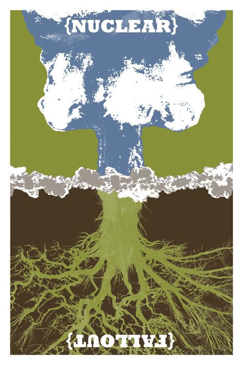
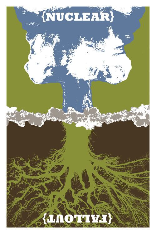
So, before I pass out for the evening, I quickly made up two version of the blue mushroom cloud image with a flatter background and another with all of the colors flattened. I'm not sure if the flat colors work better or not. Hopefully fresh eyes and other comments will help me make the big decision. I also fixed the baseline on the brackets.
 Carl
Carl
"As for the images, not bad, I wonder if there is too much going on in the background? In addition increase the baseline shift of the brackets, they're too low right now. Good typeface.
You had another idea. Don't let it go.
I haven't forgotten about the logo and INDD file. It's coming."
So, before I pass out for the evening, I quickly made up two version of the blue mushroom cloud image with a flatter background and another with all of the colors flattened. I'm not sure if the flat colors work better or not. Hopefully fresh eyes and other comments will help me make the big decision. I also fixed the baseline on the brackets.

 Carl
Carl

1 Comments:
you have some totally awsome stuff please see my blog it's www.redwallgirlrocks.blogspot.com
Post a Comment
<< Home