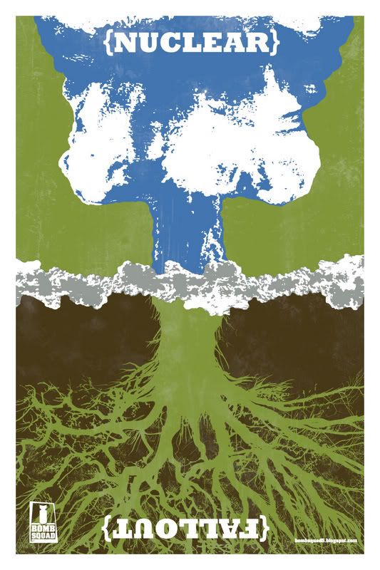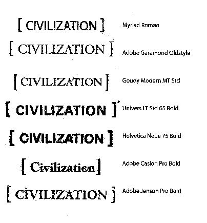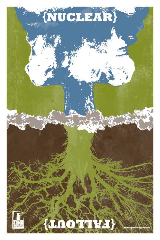
Final Civilization Poster
Here's my final poster design.
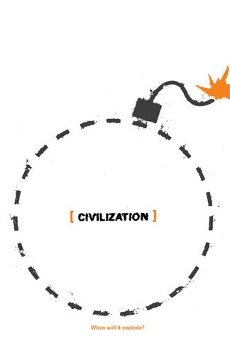
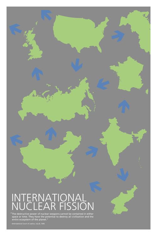
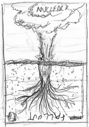
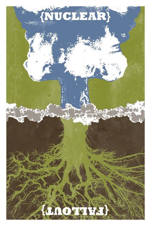
front: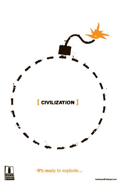
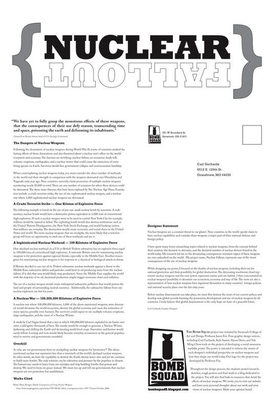
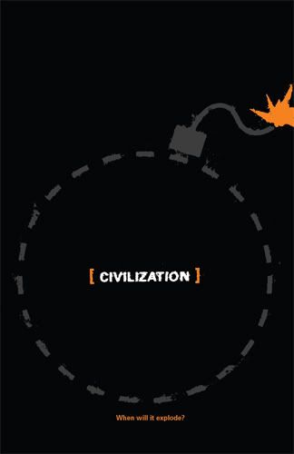
Back:
 The explanation on the back reads:
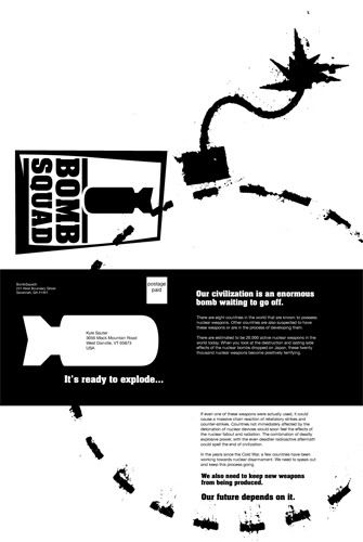
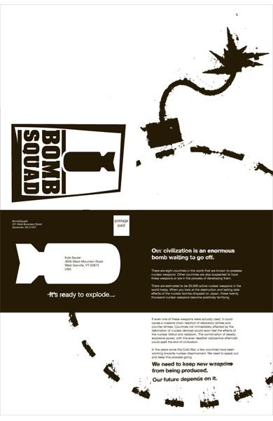
Our civilization is an enormous bomb waiting to go off.
There are eight countries in the world that are known to possess nuclear weapons. Other countries are also suspected to have these weapons or are in the process of developing them.
There are estimated to be 20,000 active nuclear weapons in the world today. When you look at the destruction and lasting side effects of the nuclear bombs dropped on Japan, these twenty thousand nuclear weapons become positively terrifying.
If even one of these weapons were actually used, it could cause a massive chain reaction of retaliatory strikes and counter-strikes. Countries not immediately affected by the detonation of nuclear devices would soon feel the effects of the nuclear fallout and radiation. The combination of deadly explosive power, with the even deadlier radioactive aftermath could spell the end of civilization.
In the years since the Cold War, a few countries have been working towards nuclear disarmament. We need to speak out and keep this process going.
We need to keep new weapons from being produced.
Our future depends on it.
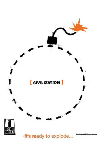
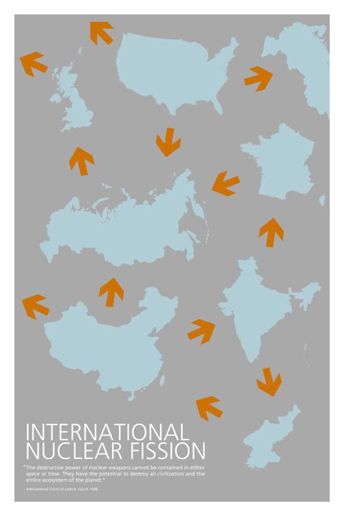
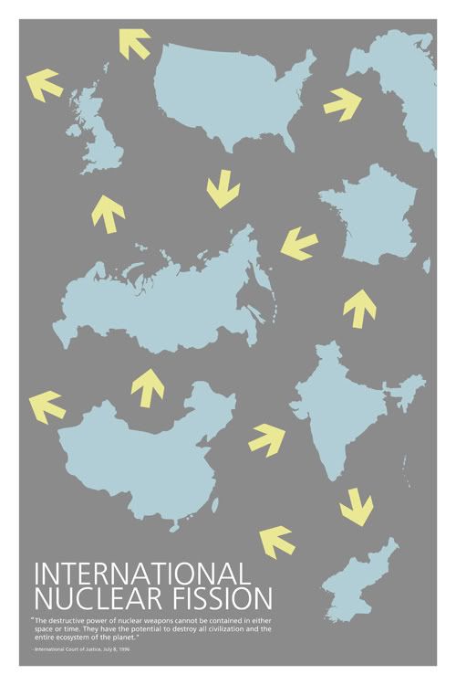
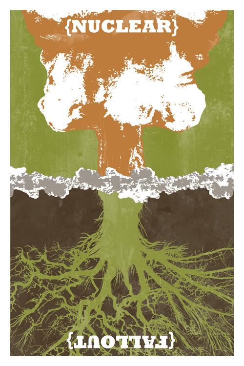
front:
Back:
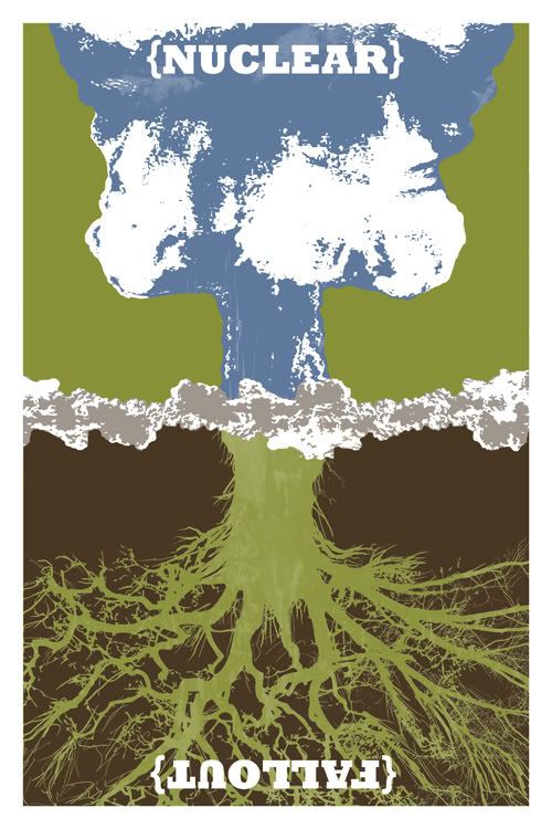
The explanation on the back reads:Our civilization is an enormous bomb waiting to go off.
There are eight countries in the world that are known to possess nuclear weapons. Other countries are also suspected to have these weapons or are in the process of developing them.
There are estimated to be 20,000 active nuclear weapons in the world today. When you look at the destruction and lasting side effects of the nuclear bombs dropped on Japan, these twenty thousand nuclear weapons become positively terrifying.
If even one of these weapons were actually used, it could cause a massive chain reaction of retaliatory strikes and counter-strikes. Countries not immediately affected by the detonation of nuclear devices would soon feel the effects of the nuclear fallout and radiation. The combination of deadly explosive power, with the even deadlier radioactive aftermath could spell the end of civilization.
In the years since the Cold War, a few countries have been working towards nuclear disarmament. We need to speak out and keep this process going.
We need to keep new weapons from being produced.
Our future depends on it.
posted by Kyle Sauter at 6:03 PM
1 comments
![]()